
Type
Research & Concept design
Client
RemoteCTRL
Role
Design Lead
Team
Data Science, Visual Designer, Stakeholders
Dashboards often go unused, or worse, data can be misinterpreted by non-experts and then used in critical decision-making.
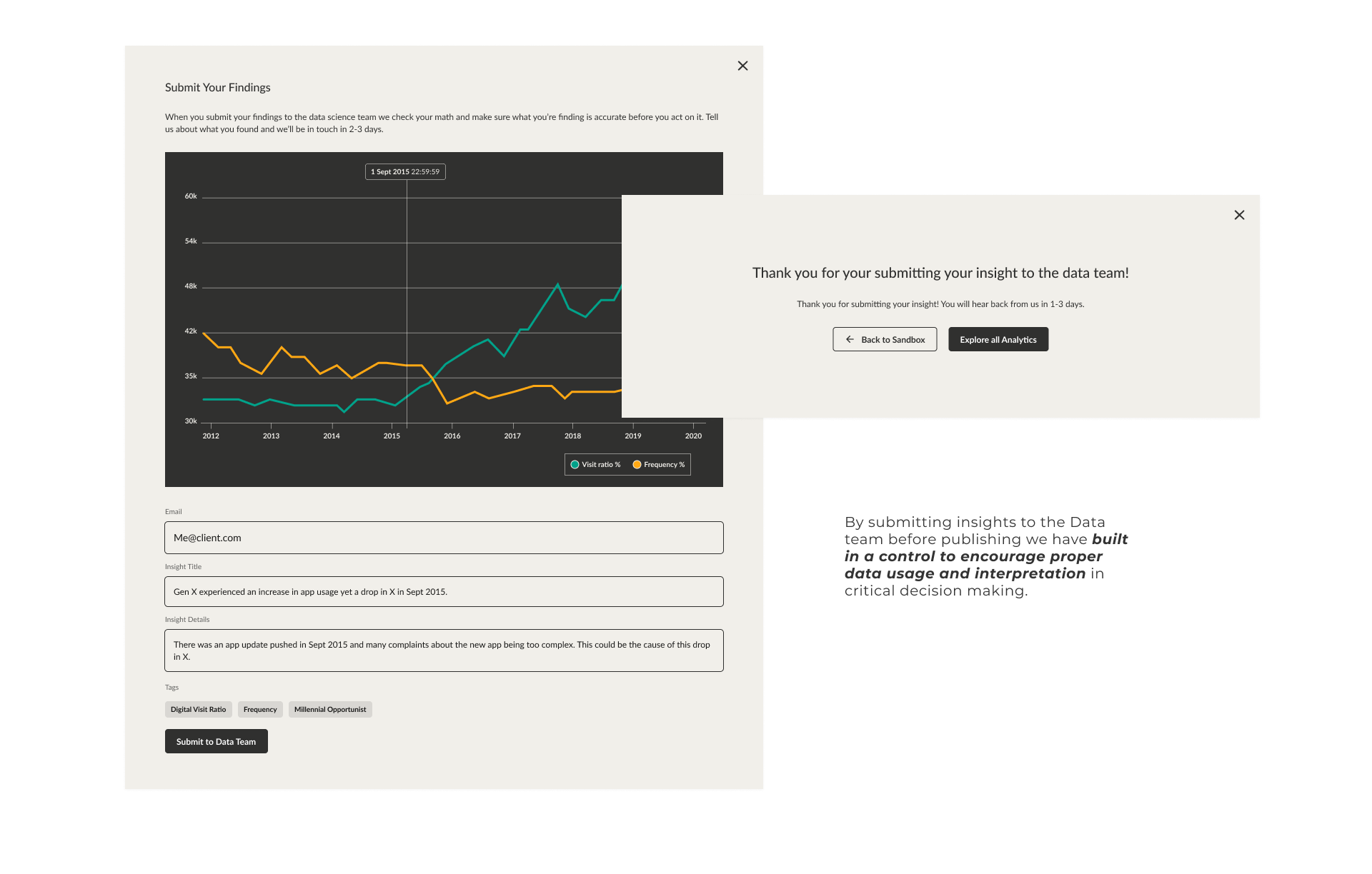
Early in the project, we identified a risk they hadn’t anticipated: dashboards often go unused, or worse, data can be misinterpreted by non-experts. After interviews with potential users (employees) and directors, we designed two key elements:
A submission flow so all data insights need to pass through expert approval before they can be shared out with the company and used in critical decision-making. This aligned with the client’s own internal directives to make data-backed decisions.
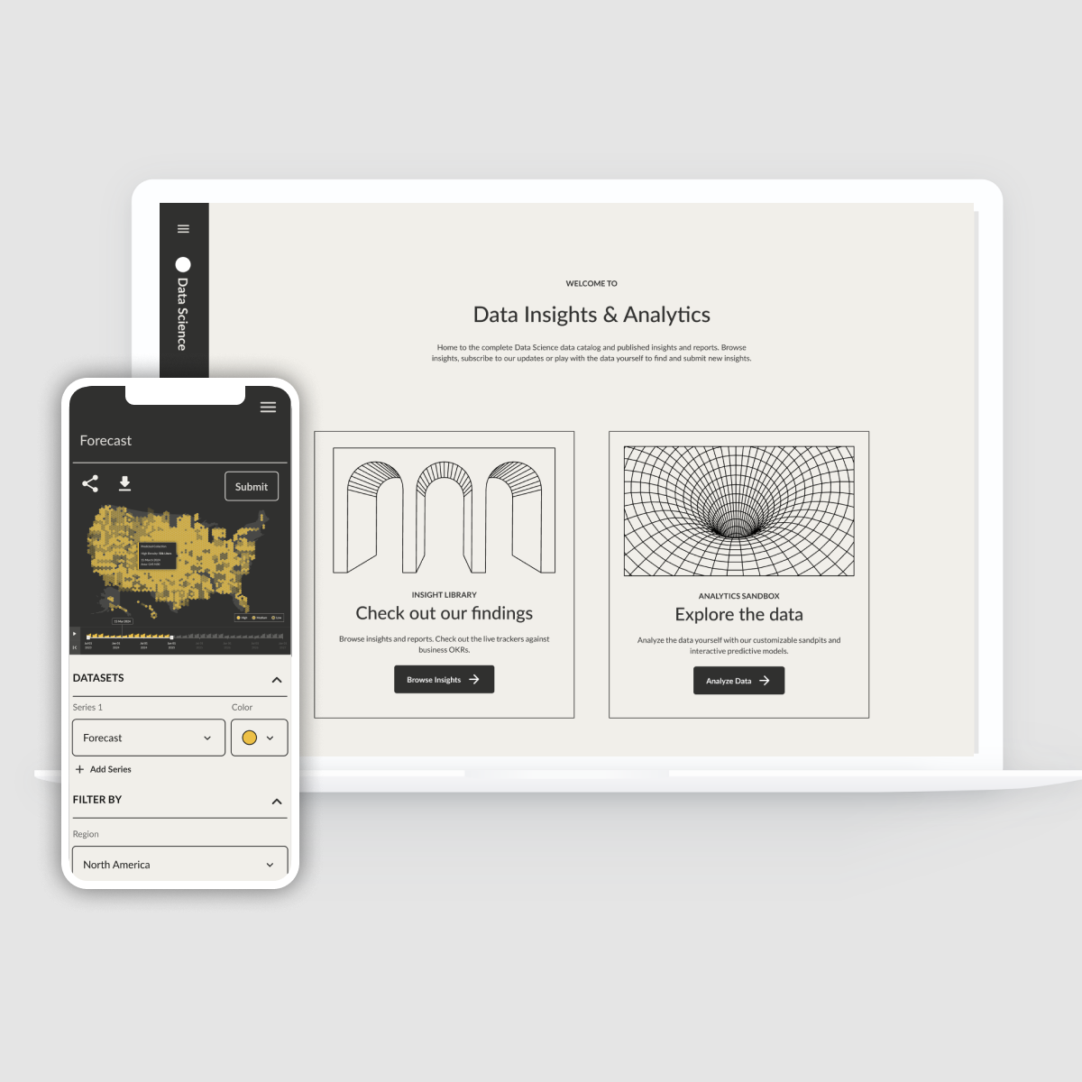
We created a “read” space where insights can be published and shared, commented on, and updated. Now the data dashboard can also be a source of truth for the whole company.
The intranet site is divided into two sections: an insight library and an analytics sandbox.
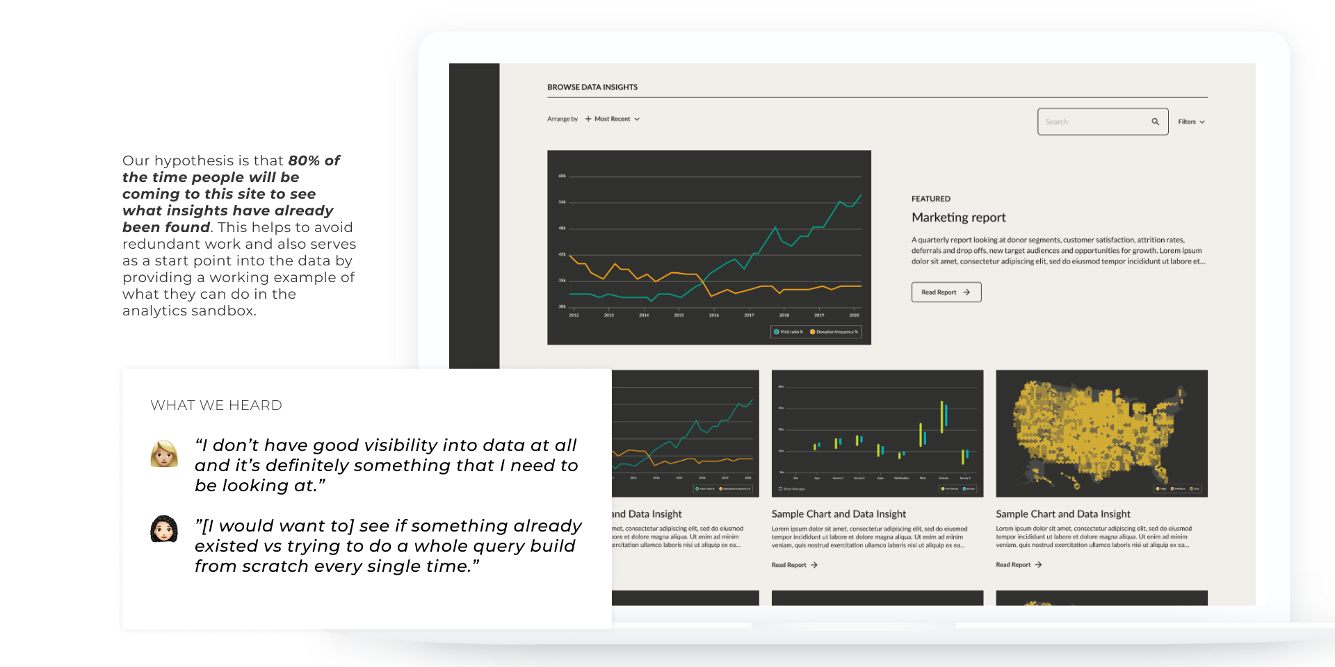
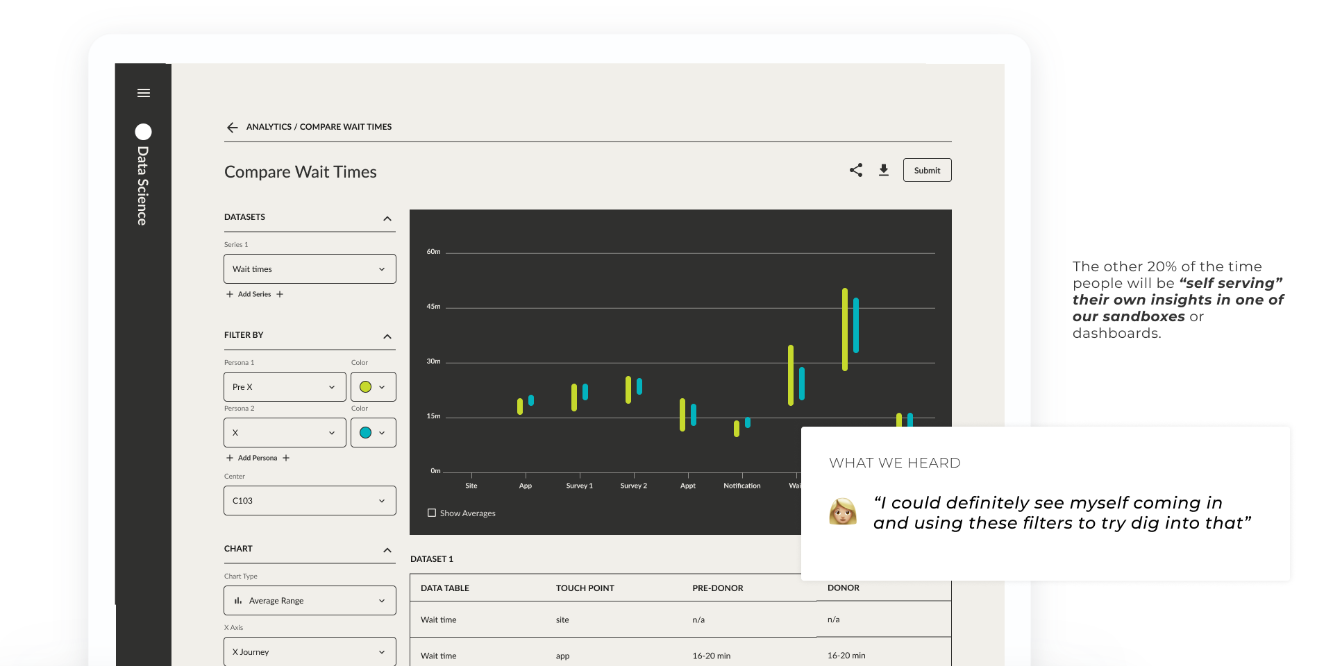
While the initial focus from the team and the complexity for the design and build really came from the analytics sandbox (a self-serve data dashboard), most of the target users we showed our prototype to said they would primarily use the insight library, and would rather subscribe to a newsletter, maybe never even accessing the site directly at all.
We learned that so many insights “die” buried in a PDF or a PowerPoint presentation, deep in an inbox. Simply having a living source of truth (the insight library) that everyone can subscribe to would solve many of the barriers they faced in making data-driven decisions in the first place.
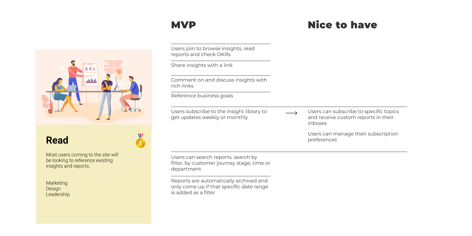
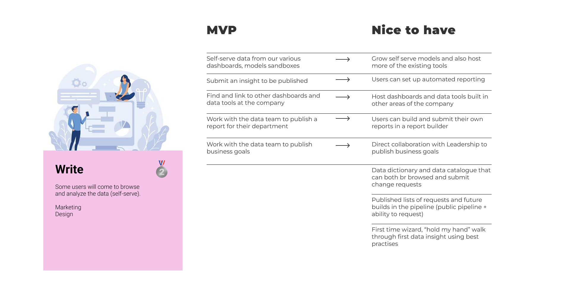
We clearly defined MVP and Nice to have versions for the dev team to plan around and mapped out all key user flows for MVP.
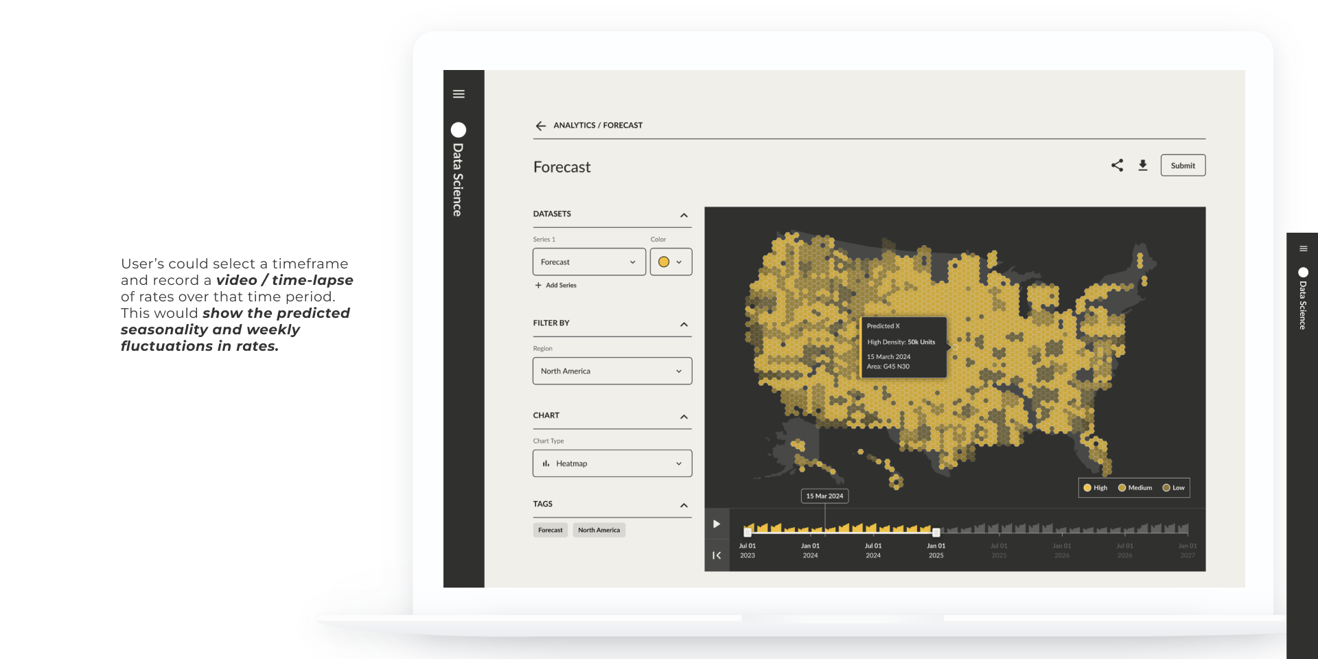
I worked with a visual designer to create a design library that both followed the brand guidelines and pushed the visual style slightly to modernize the feel of the tool. Employees like to play with the new toy if the new toy looks cool.
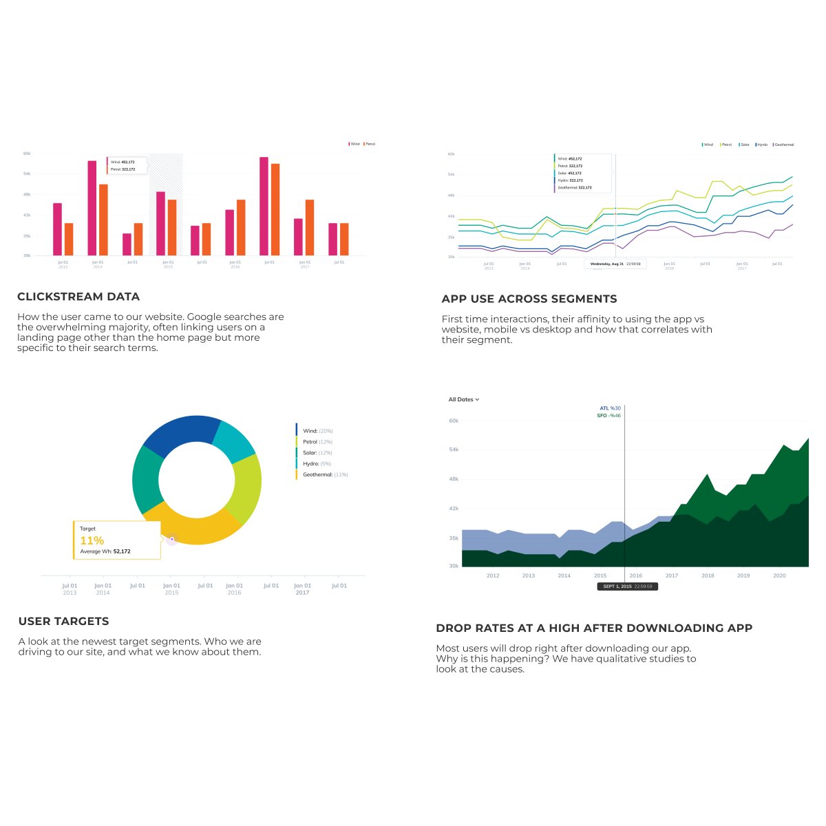
The biggest challenge for the design team was designing the charts. They needed to be highly accurate, flexible for users to adjust parameters and compare data sets, and visually cohesive.
We approached this by using real use cases and real data. We reviewed heavily with the data science team to ensure our representations of the data in our designs were accurate and useful. Then we simplified as we refined the design style and began to use placeholder text and charts.
This client was a pleasure to work with on this concept design and was really happy with the final deliverable. We had many great conversations about the potential application of AI and machine learning to these use cases. The work we did would lend itself well to a version with an AI interface and data interpretation tools. And the client later came back for work with us again to look specifically at AI interfaces for their business.