
Role
Research & Design Lead
Client
Social media company
Team
Notifications team
Type
Research & Strategy
When we asked how many types of notifications were in use. The team did not know but estimated over 10,000 different types of notifications had been coded into the app since its launch nearly 14 years prior.
We began with an open-ended look at what users valued in the app and allowed the frustrations with notifications to come up naturally. Many pain points were indeed related to notifications. But what users value in the app was more informative for us to find solutions.
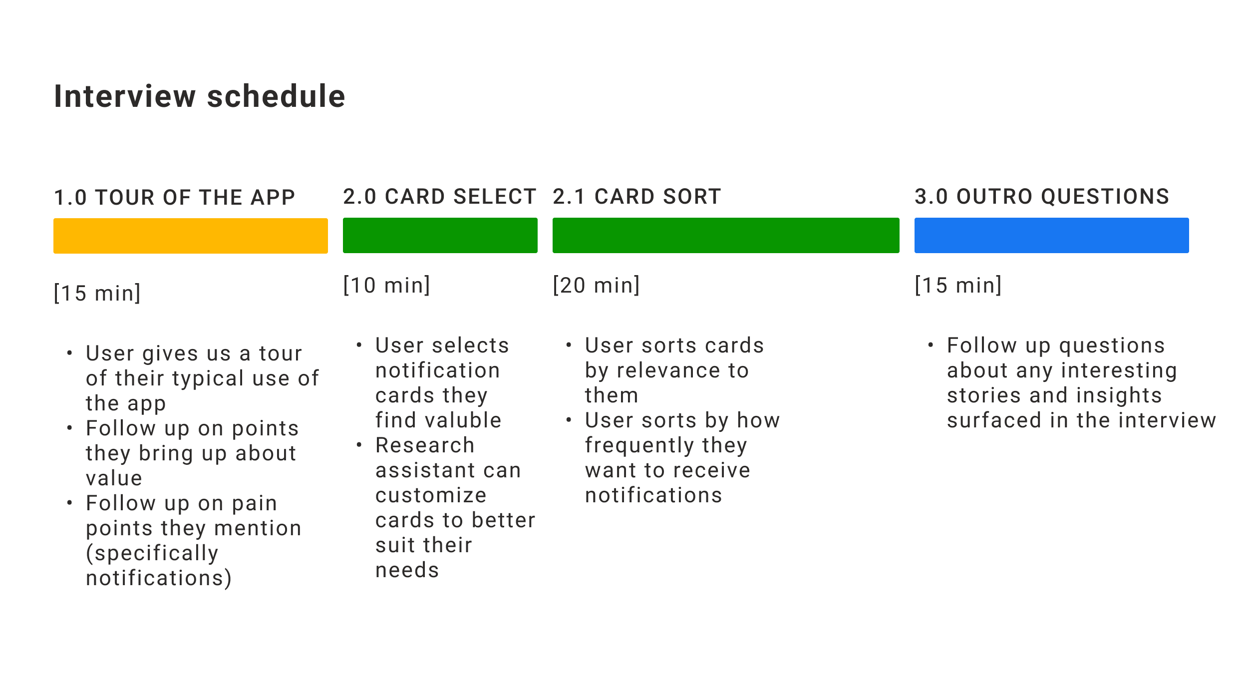
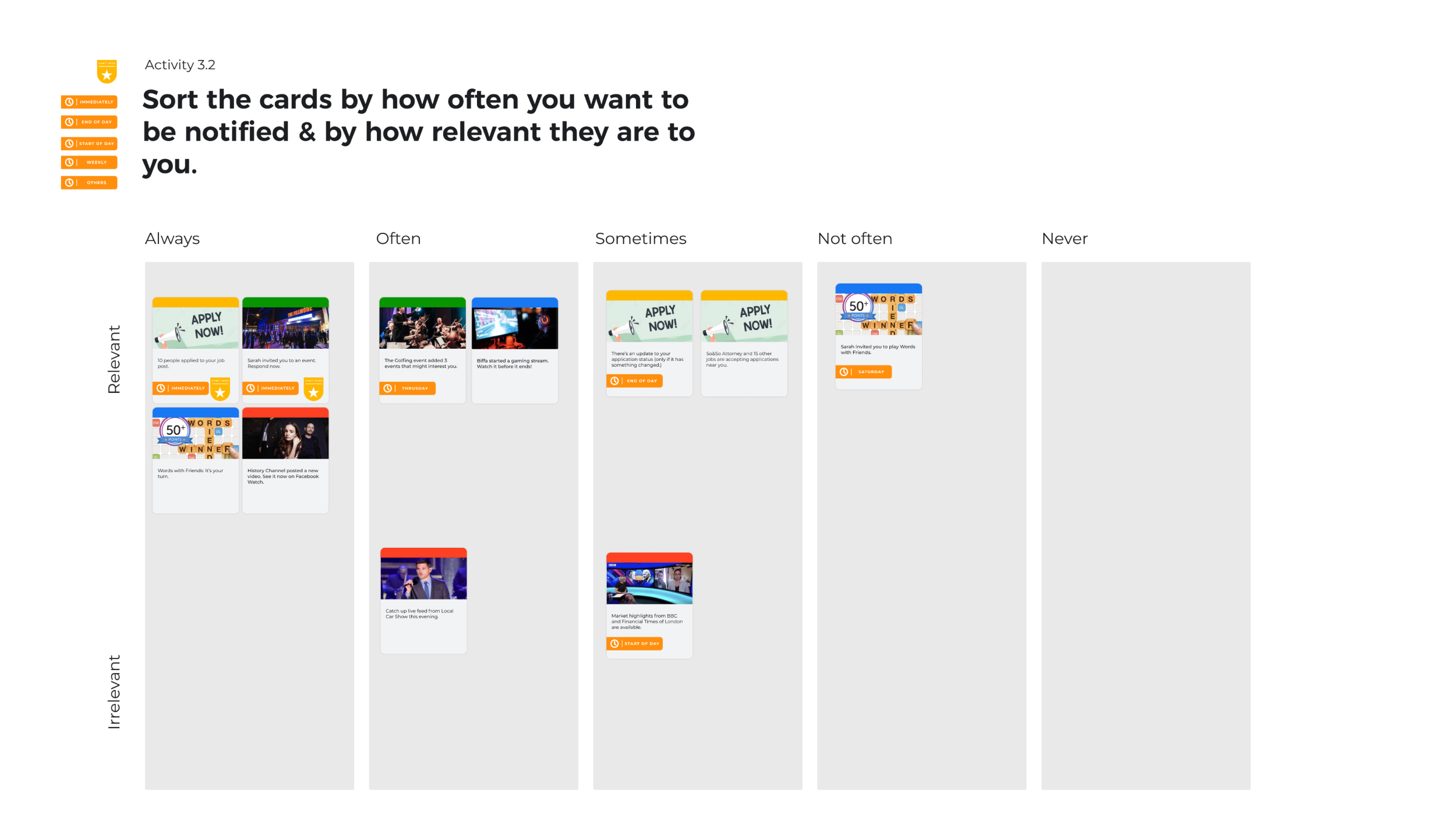
We conducted 20 remote interviews with diverse participants across the US. We facilitated a “tour of the app” over video chat and a card sort activity in Figma.
There was a perception among users that the app was intelligently learning from their behavior and serving them relevant notifications, but that the company just didn’t care about annoying them.
We knew, however, that the truth was there was a build-up of notifications added to the app over time with no vetting process and no intelligent organization or learning from users.
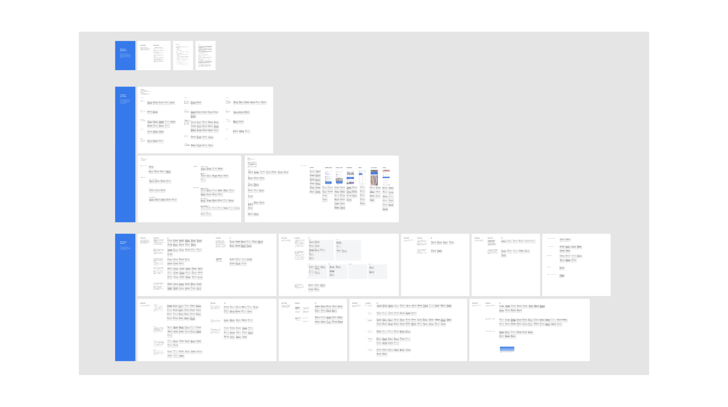
Our card sort activity allowed for a lot of discussion around what makes a notification valuable to users. And a number of patterns emerged in our synthesis of all 20 interviews. We conducted our synthesis in Figma as well. Below is a very high-level / low-resolution screenshot to protect participant information. There was a lot of detail to sort through.
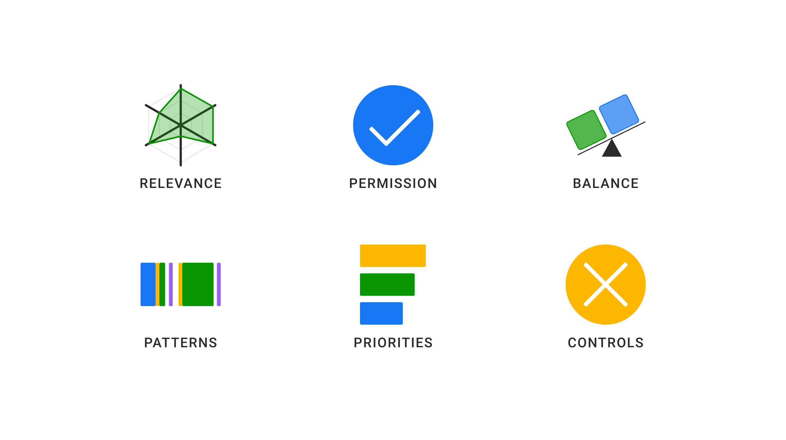
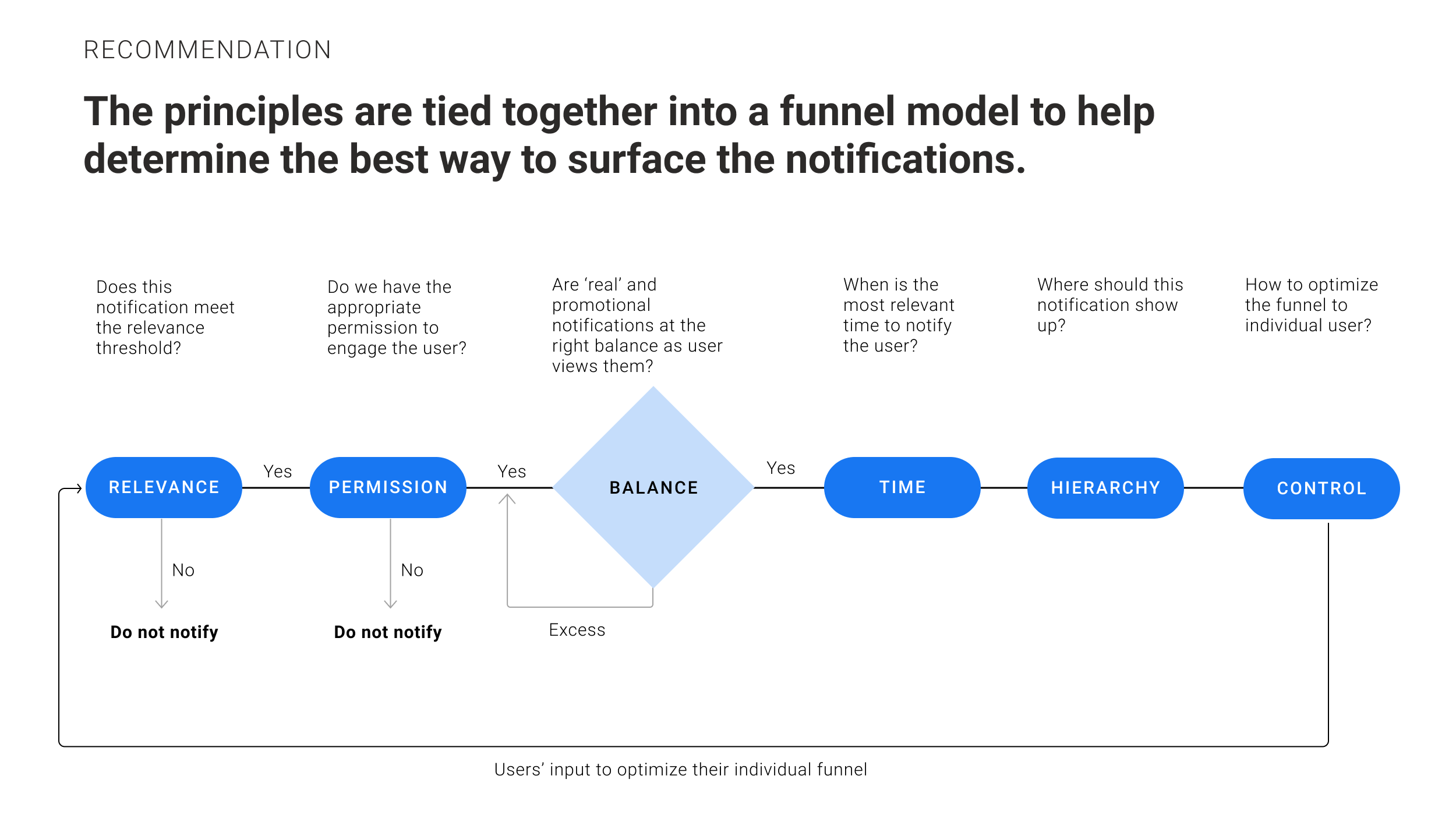
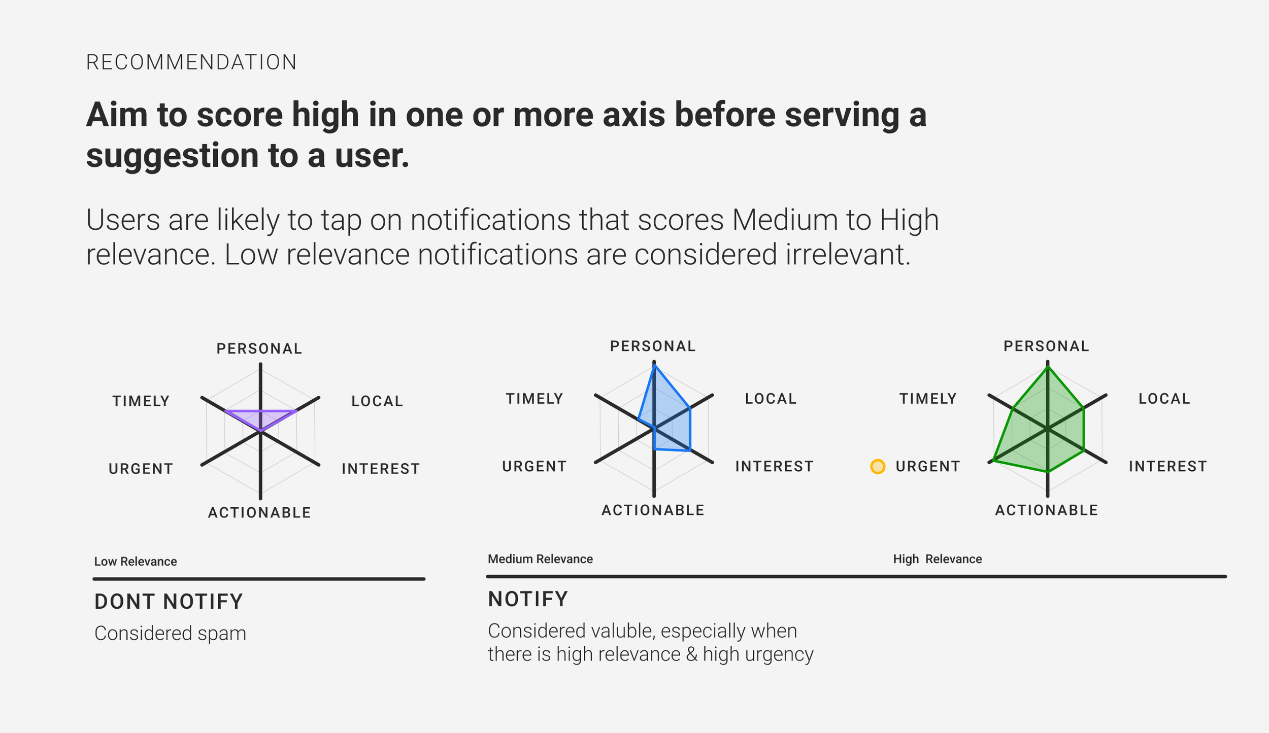
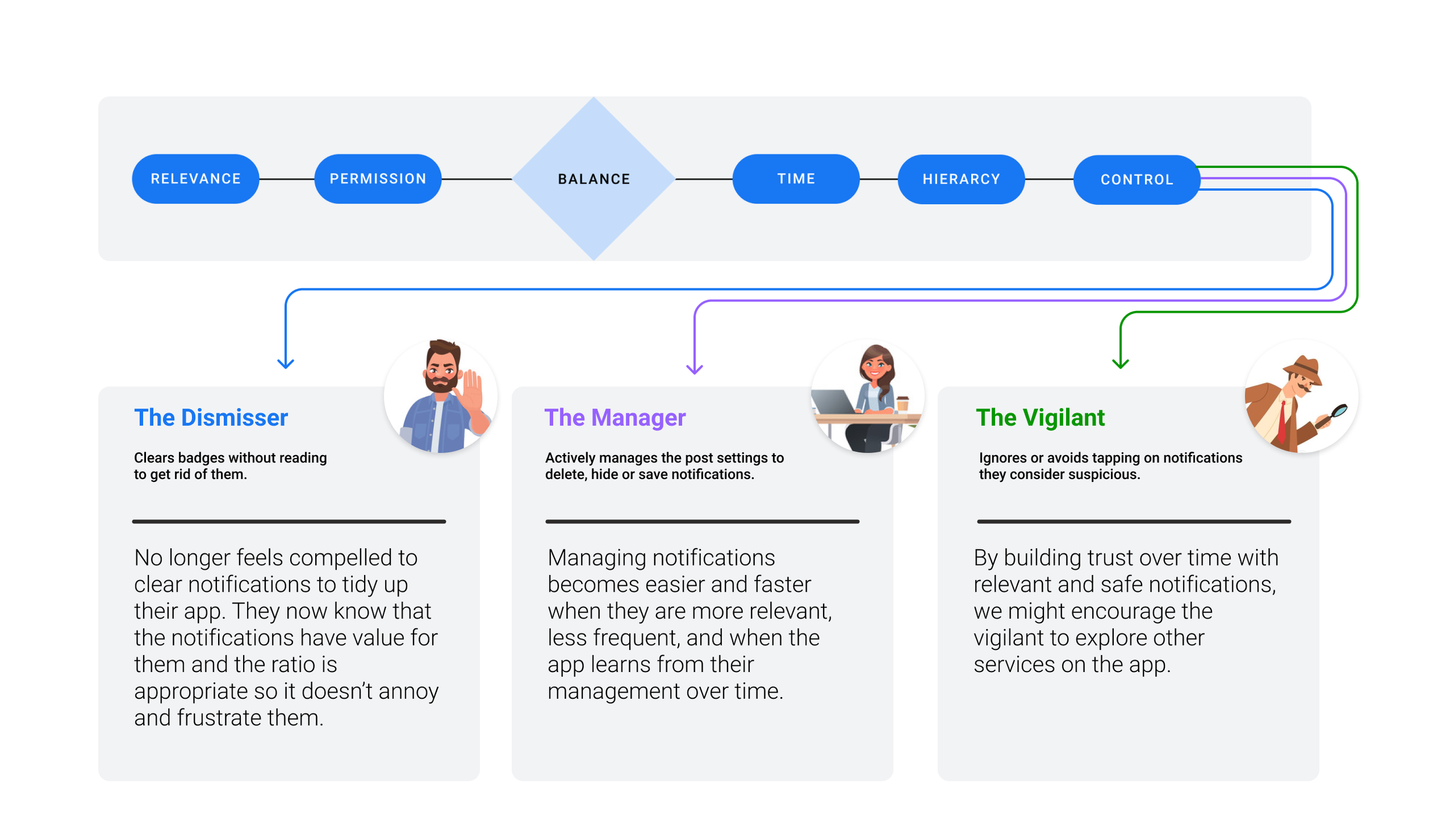
We uncovered 6 common principles that make a notification valuable to users:
Relevance
Notifications are only helpful when they are relevant to users’ interests and context. Avoid unnecessary notifications.
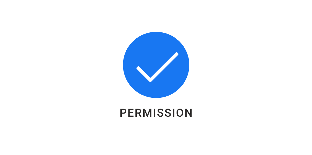
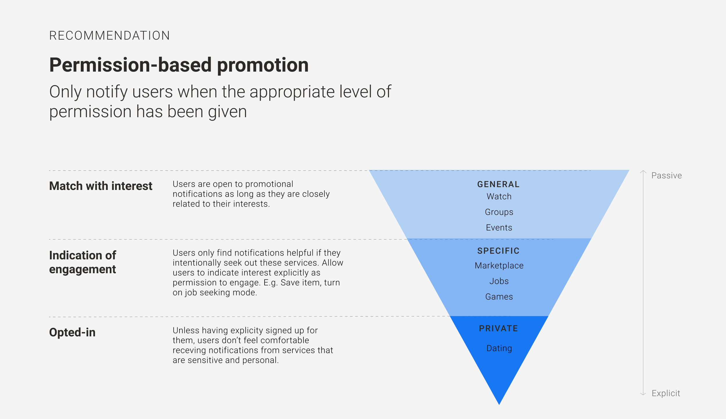
Permission
Respect users’ level of comfort by using appropriate signposts as permission to engage.
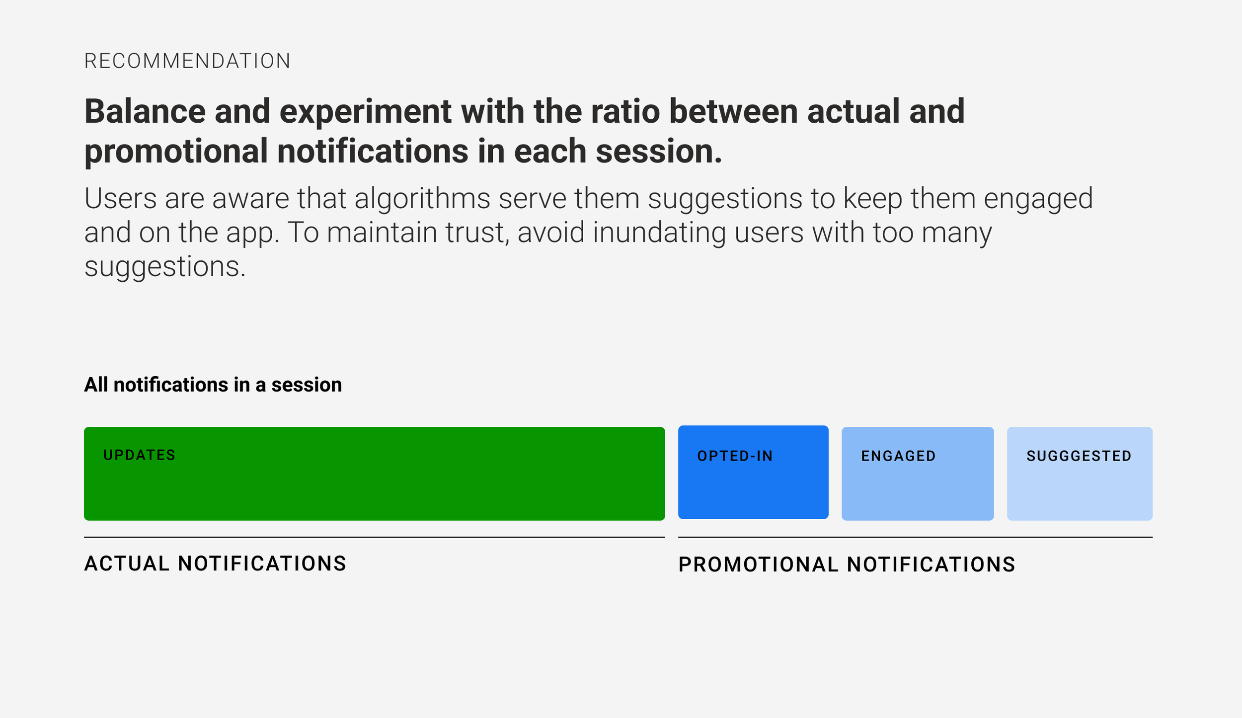
Balance
Keep the quantity and frequency of ‘real’ vs promotional notifications in balance so users don’t feel bombarded.
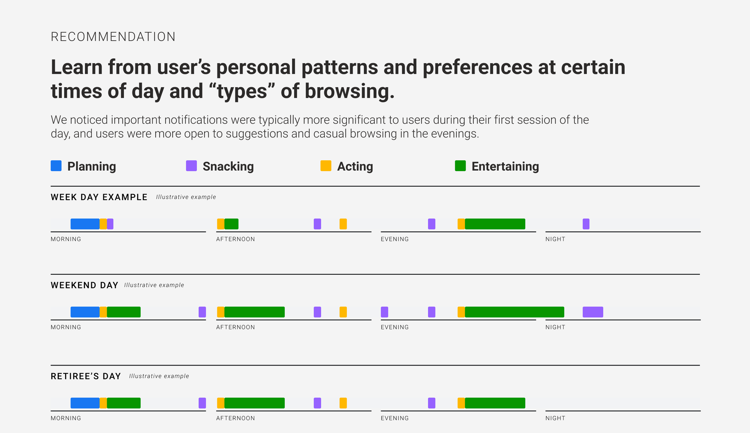
Patterns
Adapting to users’ daily habits and surfacing relevant notifications at the right time make them more readily helpful.
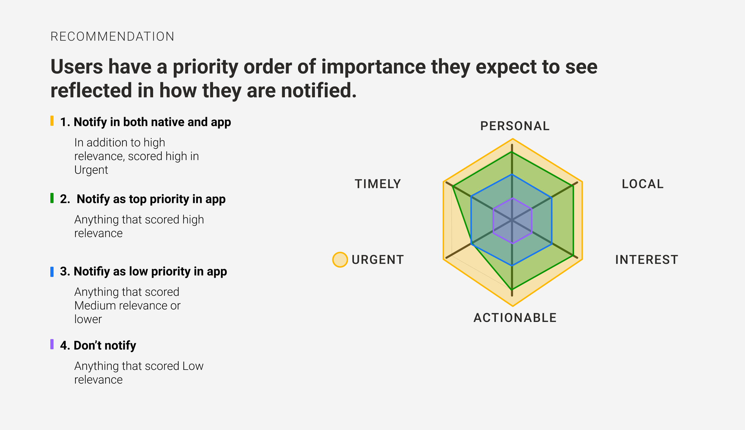
Priorities
A consistent and clear badging hierarchy can further improve usability.
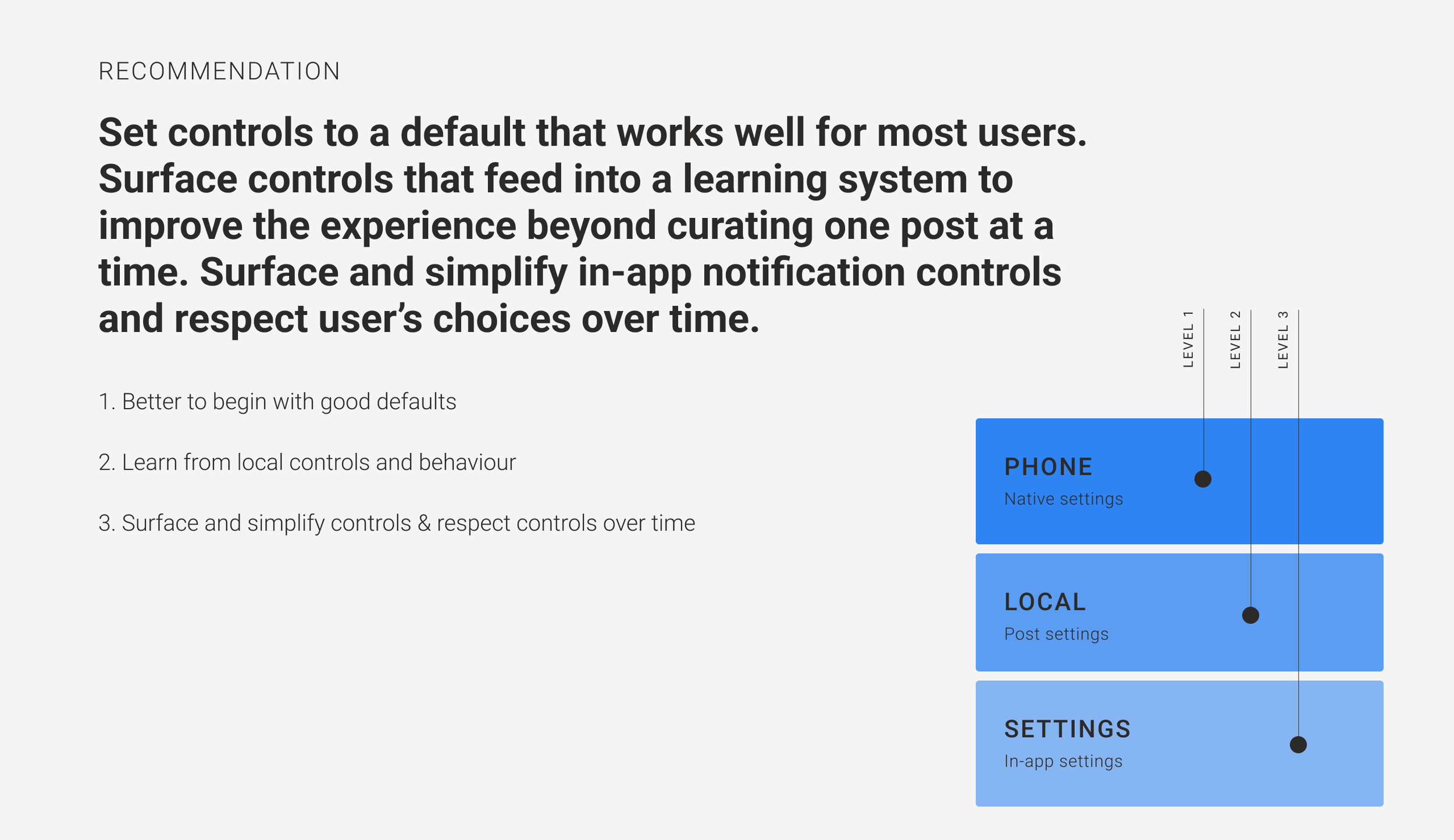
Controls
Serving relevant and useful notifications is the priority. Control is a last resort.
We then developed a tool kit to help our client improve their notifications for users. Each Principle fit into a flow chart or series of filters that could be followed to ensure notifications are not annoying.
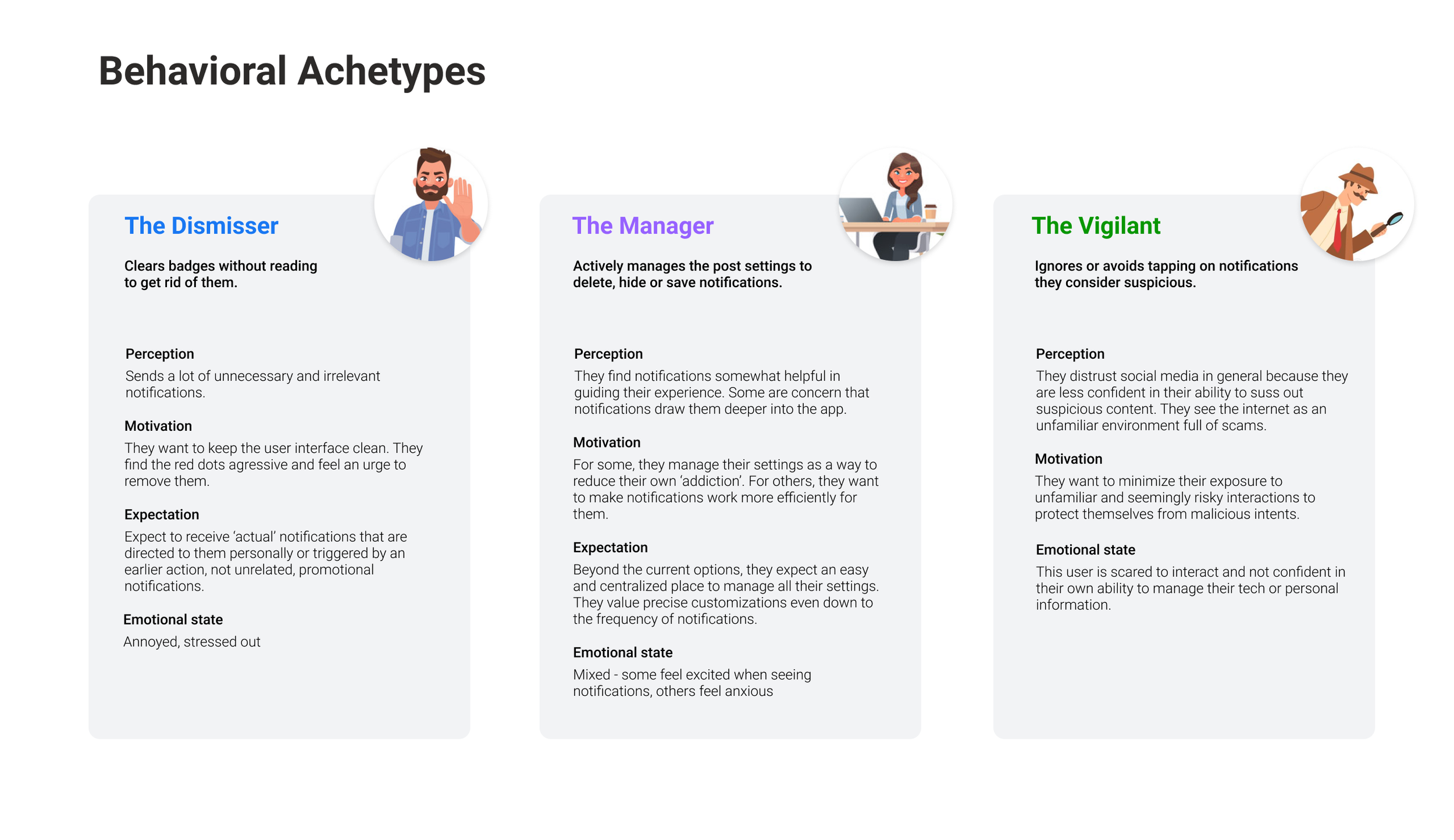
During our synthesis we also uncovered some behavioural archetypes which described the different coping mechanisms users employed to deal with too many unwanted notifications.
While our client has a sophisticated model for profiling and targeting advertising, much of that technology was not being leveraged to benefit their users’ experience.
We know they have the capabilities to intelligently serve relevant notifications and add value to the user experience on the app. We hope to see this user experience continue to improve over time.